Thursday 5 November 2015

Celtic Breeze - A Commission


Celtic Breeze. Oil on Canvas. 50cm (w) x 40cm (h)

I have been given the most wonderful commissions over the years and this was no exception. After many a secretive meeting and emails, we finally presented the birthday boy with his gift: a painting of his boat ... a passion in life. We had so much fun plotting his surprise, but his wife and I were relieved to finally hand it over in case the cat got out the bag!

I was greatly humbled by this beautifully compiled email from the owner of Celtic Breeze ....

"We’re heading back to the boat today so we had a small celebration for my birthday at the weekend when Julia gave me your wonderful oil of Celtic Breeze  opposite San Giorgio’s in Venice.
It truly is a terrific present and such complex, devious plotting that must have gone on behind the scenes to create it, only adds to its emotional value. The picture itself is a wonderful depiction of the boat and perfectly captures all that makes her a special home from home for me. The background of San Giorgio’s adds both architectural, geometric contrast and beauty as well as capturing a unique highlight of our sailing travels. The painting itself magically uses all the colours and more that are involved in such a scene; I can hear your voice extolling us inadequate pupils to greater heights of colour adventure as I look at the white hull and see the richness of the colour you have employed to depict that otherwise bland surface. Simply put, I love it and I thank you for the skill and effort you employed in a subject that was a new challenge for you and is now a treasured gift for me."

Squerryes Court - A Commission


Watercolour: 58cm (h) x 39cm (w)

I was thrilled to be given a commission to paint this beautiful estate this summer. It has been on my radar for many years ... a familiar attraction in my neighbourhood. I finally had the opportunity to visit Squerryes Court and its stunning grounds, with my client, on a warm May day with my camera and sketchbook in tow. My client's daughter was fortunate to be getting married in September and her wedding gift from her parents was to be a painting of the location of her wedding day. The overall impression was to be loose, colourful and romantic. A wonderful and fulfilling challenge.

Plums


Oil on Canvas

I put my oil students to the test by giving them this still to copy. Their brief was to paint certain objects in a restricted number of strokes. I was excited by their results! Being aware of the number of strokes they had to use, influenced their style of painting as well as the shape of the stroke and the amount of paint they deposited on the canvas. Their paintings were dynamic and very much alive. Very rewarding from a tutors point of view.

Still Life with Cherries


Watercolour, Acrylic Inks, Collage and Tissue Paper

I absolutely loved putting this painting together. The process was unpredictable and the discoveries en route were very exciting. I was inspired by the artist, Shirley Trevena, when I put the brief together for the Jacksons Art Group. I love her use of bright colours and the quirky way she puts her objects together. She is the master of her craft and there is no point trying to mimic someone like her. I did, however, draw inspiration from her books and decided to let a still life develop as the painting process developed. We incorporated tissue paper, inks, watercolour and patterns created from masking tape and cling film into the one piece of artwork. One of the group was horrified that I had felt the need to put so much into it. I had to explain, that being the tutor, I had to demonstrate all ideas and options to the group so they could decide what worked for them. The fact that I was having a blast was just a bonus!

Protea and Autumn Leaf


Watercolour

It has been refreshing returning to the traditional application of watercolours. Traditional certainly does not been easy, and that is why it is very important to focus on watercolour washes and brushstrokes. Artists love to push the boundaries and experiment, but the danger is that we can start to lose sight of good painting techniques and clean, clear colour mixing, and so on. The sketches above were part of a class exercise where we focused on background washes and shapes, simplification of the form, tonal values and combining variegated washes in one object ... very useful and enjoyable.

Sunday 12 April 2015

Art Exhibition - "www.adiefineart.weebly.com


I am very excited to present a body of work in Crowborough next month. I hope you are able to pop in.

Happy Hour - "www.adiefineart.weebly.com"


Acrylic and Oil on Canvas

I so enjoyed painting this scene. I have attended a few concerts in the grounds of this delightful castle, so the scene is very familiar. The restaurant where this painting can be viewed, and hopefully sold, is opposite the castle, so I thought it would be a good idea to link the two. The cockerel changes everything and hopefully adds a comical twist to the occasion.

Bon Appetit - "www.adiefineart.weebly.com"


Acrylic and Oil on canvas

A friend of mine, who lives in France, is opening a restaurant opposite the a beautiful, fairytale castle in May. (Montclera Castle). She asked me if I could paint them for the bare walls of her new restaurant. I incorporated the tower at the entrance to the castle and my favourite characters .... cockerels and hens. The storyline is a little silly but I did chuckle during the painting process. The hen is determined to cross the road to have her meal! I used my favourite cobalt blue acrylic background to get started and then incorporated loose lines and areas of detail to bring the scene to life.

Wednesday 1 April 2015

Cardiff Castle in the Snow. "A Tutorial". www.adiefineart.weebly.com

I worked together with the Jacksons Art Group to create this subtle magical painting. A welcome challenge for all of us as we were tested once again on our ability to manage washes and traditional watercolour techniques.


There is so much you can do with the magical “white” view of Cardiff Castle. Whites only come to life when you wrap them in tone and colour. I cannot take credit for taking this photo myself. I am a great supporter of “paintmyphoto” which supplies me with photographs that I cannot take myself.

DAILY  PLAN
This is a challenging subject that offers many wonderful outcomes and creative interpretations. I plan on putting my washes to work in order to establish the ground work for my “whites”. Please do have masking fluid at the ready as it is an important ingredient in the early stages. I also advise that you have a small, old paintbrush to apply it with. You will get a better variation of “masking” markings which you will be grateful for later on. Once again, we have two mornings to create our masterpiece, so one step at a time. 

MATERIALS: Please read it through carefully 
Paper: Ideally a big sheet or block of good quality paper i.e. Arches, Saunders Waterford, or Fabriano 300gsm. If you are using a single sheet (bring in a board for support), then it should be prestretched or ideally a heavy weight i.e. 640gsms. Cold (N) pressed. 12inch x 16inch or bigger. 
Drawing Equipment: Sharpener, blu tack, masking tape, and an HB or 2B pencil or coloured pastel pencil.
Watercolour Gear: Brushes - I tend to use a big wash brush - size 30, a selection of medium filberts and rounds and a sable liner or rigger for detail).  Palette with big mixing wells, water spritzer bottle with fine spray, kitchen towel.
Colours - tubes are easier: lemon yellow and or quinacridone gold, cobalt blue (or french ultramarine), cerulean blue, sap green or russian green, permanent rose, cadmium red, winsor violet, indigo or paynes grey and raw umber. There are many alternatives so feel free to substitute your own colours for the ones above. 

Other: Masking fluid, small old paintbrush, and white gouache (only for those who might need to restore a few highlights during the last stage).


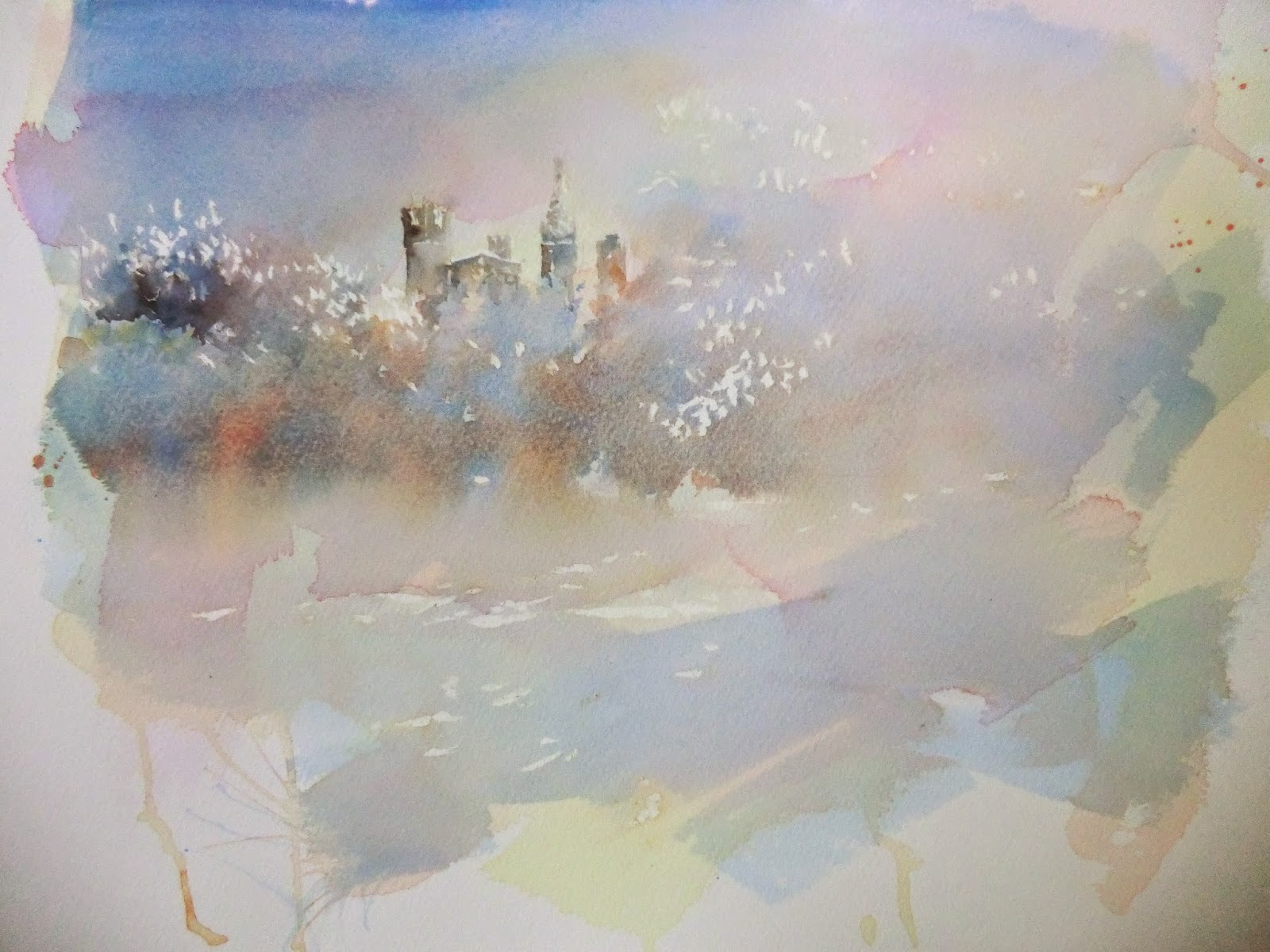
  • Simple drawing suggesting the buildings and baseline of trees.
  • Only apply masking fluid where necessary ... roofs of the buildings and small amounts on trees and snow in foreground. Better to use old, small watercolour brush. Coat the brush in fairy liquid first - it is easier to remove masking fluid once finished. Make sure m.f. is dry before painting.
  • We then applied VERY light washes of quinacridone gold and permanent rose using a big wash brush (diagonal strokes). Let the wash dry completely and apply a weak layer of cerulean and cobalt over it. Let that dry and see if you need any other layers of pink or blue.
  • We then added a few more wet washes to the treed area adding blue and wet-in-wet drops of orange. (can mix cad red and quin gold). This helped to warm up the tree line and bring it forward. 
  • I used mixtures of cad red and cobalt blue to ‘fill in’ the buildings and add tone to the upper tree line.
  • Once dry it is safe to remove the masking fluid. (I rub blu tack over the fluid and it takes it off easily). 


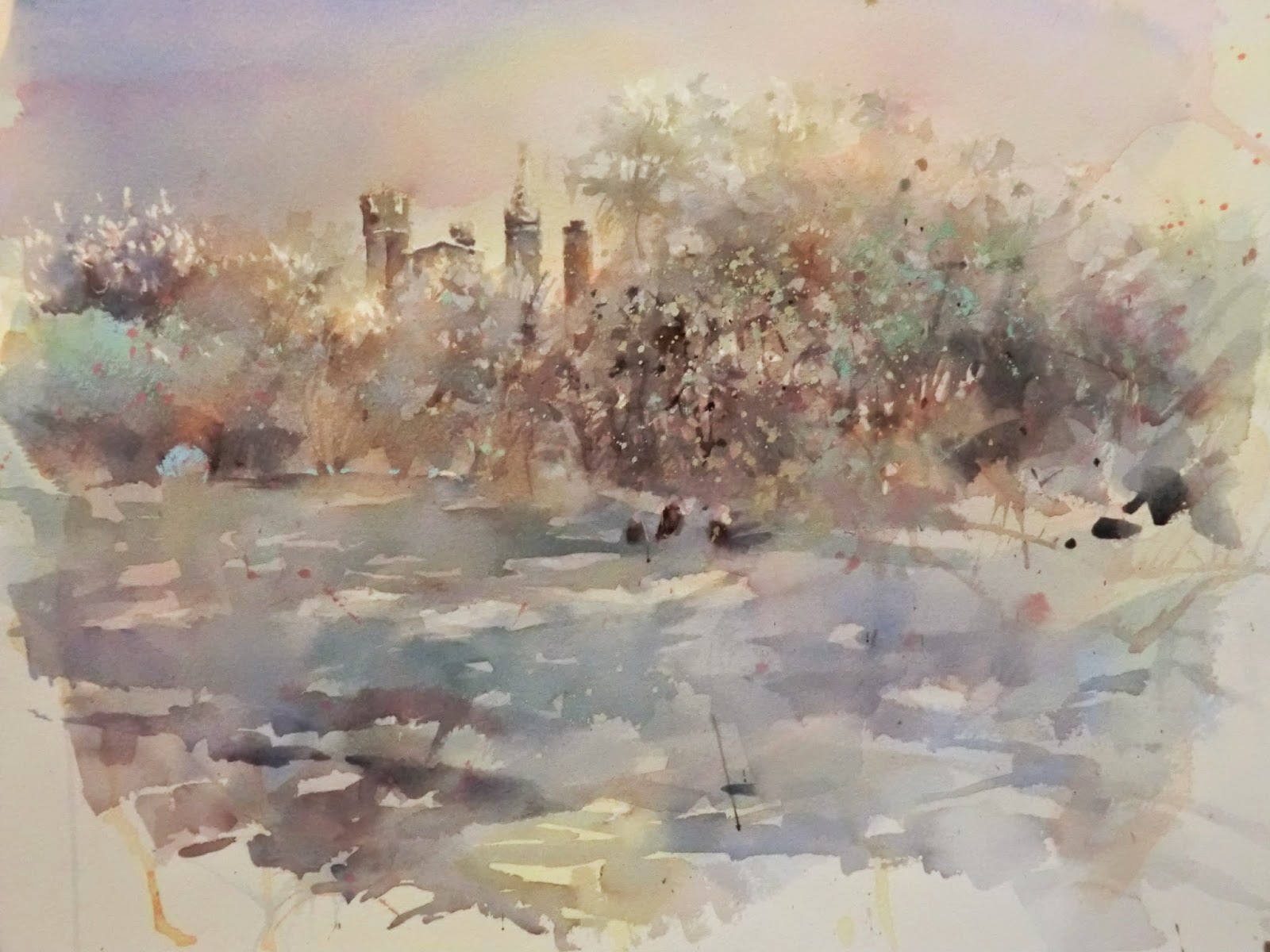
  • Stage Two was all about establishing tone and texture in the trees and foreground. Patience is a must as it takes time to build up the fine branches .... the only form that knits the painting together. I used a little indigo in my mixes to establish the middle ground.
  • Darker shadows and objects were strategically placed and I made sure they ‘dissolved’ into their surroundings. 
  • A big brush was then put to work to describe the vast foreground of snow. Quite tricky as it can look like water instead. Make sure the brushstrokes are varied and that you use a selection of diagonal strokes rather than horizontal ones. 
  • Softer shades were applied all over using mixes of gouache, naples yellow, cerulean blue and cobalt green. Bold flicks are great fun and help to break up the tree line and create the illusion of snow. 


Sunday 15 March 2015

Pink Garlic: A Class Exercise. www.adiefineart.weebly.com


Watercolour 

I have been so inspired by the BBC programme "The Great Painting Challenge". Watching each contestant sweat through the process has been more informative than the end result. I just wish they had all stayed and worked on a point system, as it would have been interesting to see the development throughout. I have been dying to try some of their projects! It has made me realise how much I would love to tackle more difficult subjects in more challenging environments.

I have decided to incorporate more class exercises in my blog as they might be helpful for some of you ... possibly give you ideas. Garlic is a wonderful subject to paint with its textures and curves. Trickier than we give it credit for. 

The cool interpretation began with a light wash of winsor violet and cerulean blue and the warm version was created using a light quinacridone gold and cadmium red wash. Clingfilm was then pressed into the wet paint, and, once dry, peeled away to reveal a beautiful pattern. I prefer to paint without drawing but I encouraged my students to plot a few oval contour shapes in pencil to give them a confident start. Painting any sort of pattern can lead to problems if they are too regular (or dry and opaque) so one of the lessons was to suggest the dry skin without overstating. Allowing the patterns to merge creates a comfortable flow around the whole garlic. One can also soften patterns with light glazes as well as add discord colours i.e. cobalt green over large areas of pink.

I am trying to encourage my students to interpret a familiar object/subject in unusual ways and not be restricted by what they feel it should look like. I am a stickler for technique and using mediums to their full potential, so I never lose sight of that, but there is a big difference between a good painting and a great painting. Pushing the boundaries and thinking out of the box, even in small ways, is exciting Progress can be made in leaps and bounds even if one feels vulnerable.

Sunday 8 March 2015

"Evie": www.adiefineart.weebly.com


A Commission in Oils

Grant, I really want to thank you for giving me such a wonderful open brief. I was sent a selection of photographs and was told that I could choose whichever one I liked and do whatever I wanted with it. Music to my ears. As I know my model so well, it became a celebration of colour and I just allowed my instincts to take over. I used large strokes of colour layering subtle tones over each other and using palette knives where applicable. The colours are unusual but so exciting. It truly was a case of a giving myself permission to experiment and lose myself in my creative moment.

"Never, Never, Never Give Up" - www.adiefineart.weebly.com


A Commission in Oils

This commission was a sheer joy to paint. It captures a special moment in my wonderful, talented friend's life, where she is taking great strides across the beach in Australia. The Gold Coast holds sentimental memories for her and she is enjoying her favourite activity. Evie has the strongest resolve and determination I have ever known and the appropriate mantra "never, never, never give up" describes her completely. I enjoyed the challenge of capturing the subtle colours and tonal changes in the sea and the sand and depicting Evie's stride as accurately as possible. I had a few curious onlookers as I drew the message in the sand - accuracy is key and I wanted the message to be subtle and believable. Thanks for the commission Grant.

Saturday 21 February 2015

"I'm Too Sexy for my Wattle": www.adiefineart.weebly.com


Acrylic on Canvas: 51cm (w) x 76cm (h)

It is safe to say that I chuckled the whole way through painting this piece. I love these wild birds! They lend themselves perfectly to caricature. It is called the ground hornbill and I have only seen them in the african bushveld. It is quite a surprise to see such a large bird in an environment populated with all sorts of predators. It is probably more surprising to see a bird with such big eyes and eyelashes hopping about. I emphasised the wattle by applying a permanent layer of white tissue paper. It worked a treat. I also used paper collage in the background to diffuse some of the texture away from the wattle and create some balance. I then enjoyed using my acrylics straight out of the tube, making sure to enhance the hue and tonal values where needed.

"A Celebrated View of Trafalgar Square": www.adiefineart.weebly.com


Mixed Media on Watercolour Paper.  54.5cm (w) x 41cm (h)

These mixed media artworks get more and more exciting (and maybe more weird and wonderful) the more I do them. I can apply all my painting and drawing techniques and approaches to one painting. One's imagination can run riot and who says that distortion and exaggeration can't play a part! I enjoyed using punchy colours and splattering paint all over the place. 

"Tabitha": www.adiefineart.weebly.com


Mixed Media on Board: Acrylic Inks, Watercolour, Paper and Coffee Washes. 39cm (w) x 57.5cm (h)

I really did not know how this portrait would evolve. She was a wonderful challenge. After establishing the "paper shapes" I started with neutral tones, or washes, and then started to add the stronger ink lines and wetter areas. The colour seemed to be a natural progression from there. I used white acrylic ink to achieve a few selective, milky highlights. This is a highly intuitive process and I am very excited about it.

"Gemma":- www.adiefineart.weebly.com


Mixed Media on Board: Coffee washes, paper and acrylic inks.
37cm (w) x 51cm (h)

I am so enjoying using mixed media at the moment. It gives me the opportunity to mix up the mediums that I have grown to know and love and really think out of the box. I still use my watercolour techniques for wash work and make sure the design is balanced. It is certainly more unpredictable than a traditional approach, but without some adrenalin and mystery, I would probably fall asleep on my feet.

All in a Day's Work

Please take a look at my website: www.adiefineart.weebly.com


Acrylic Ink: 27cm (w) x 38cm (h)

Playing with animal characters is so rewarding. It allows the imagination to run free. I used acrylic inks to describe my hardworking giraffe. Keeping her lose and spontaneous was key.

The Preview Evening at the Mall Galleries


The Preview on the 6th January 2015 - Artist of the Year 2014

I would like to say a big 'THANK YOU" to all of you who went to the Mall Galleries to support this exhibition. I was totally unprepared for the phone call from Art and Illustrators which informed me that one of my paintings had been selected. My inspiration had come about due to an interesting combination given to me by the editor for Leisure Painter. I do love intricate interior spaces so I was dying to try something new with my V&A photographs. The process was fascinating and I remember being rooted in front of my canvas for a number of works solving one layer at a time. The feedback from various people stepping into the studio encouraged me to enter it. I am so glad I did! 

The preview evening was great fun and the vibe upbeat. We were allowed to take a couple of guests, so my sister Gaenor and long time friend Diane, accompanied me to the gathering. Meeting other artists was, and will always be, a treat: learning about their backgrounds and interests and what inspires them is wonderful. We are all working extremely hard to achieve our goals.